In an effort to try and shrug off the blues that were hanging on from yesterday, this morning I took out some brown, blue and metallic paints, added a few bits of paper and some stamps, and had a little play with some canvases I've had knocking around here for a while...
I wanted to try making a paint textured background, incorporating some paper collage elements, and a simple collaged focal point. This isn't a style or ratio of paint to paper I've tried before and I'm honestly not too sure about the results.
This was the progress:


It's not quite finished. And, as I said, I'm not sure whether I actually like it or not. But then I very rarely like a piece just after I've worked on it.
I still need to integrate that tree a little bit, without blending it into the background too much, and work on the contrast in the whole piece. It's all a bit mid-toney at the moment - needs some dark darks and light lights methinks!
I also feel I have over-texturised it all and might have preferred it when it was simpler and less busy. I always love the texture that other artists achieve in their works but perhaps I was a bit heavy-handed. It was an exercise in texture though, so maybe it's just because I am not used to seeing quite so much going on in my own stuff.
Normally, if I leave something for a while, it either grows on me or I'm better able to see what needs doing to "fix" it. Although sometimes that involves painting over the whole thing and starting again!
There are parts of it that I like though. Here are a few close-ups:

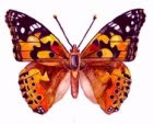
I bought this butterfly stamp over a year ago and today is the first time I've used it. I like the way the paint worked with it instead of the way that ink would have done. Macro captured, micro texture.
I've also been waiting for an opportunity to incorporate the labels you can just see peeping in to the bottom right of the butterfly stamp. I love the look of these, especially the text on them. They're tags that I collected from some particularly nice teabags a friend gave me as a gift.
I love the design on the Polish stamp below and, again, came by a few of them about 3 years ago, but have been holding them in my stash instead of using them, for fear of not having them to use. What's the point of that?

Anyway, results aside, I did enjoy the play and it did distract me, which was the intention. And it's supposed to be more about the process than the outcome, isn't it?
Although... I'm so blundering around here - with a lot of enthusiasm and a lot less skill and - wouldn't (at all!) mind some input from you creative creatures out there... If you have any ideas about how it could be improved or the mistakes to avoid next time 'round, I'd be very appreciative of your thoughts...
After I set the blues aside, I started working on the second canvas I'd prepared in brown and reds...
This is far as I went with it today:


.jpg)

.jpg)


2 comments:
They are both so beautiful! Can't give much input, as I have no experience really. In the first one I would paint or stamp something over the tree to blend it in (I love the lettering, btw). In the second one maybe add something in the middle section? I SO much want to do something similar in my journals, my paints are all primary bright colours though ... somehow my stuff all comes out as Sub B work ...
Thanks anairam! I know from your blog that you have a keen artistic eye and creative hands so really appreciate the input and encouragement. And I LOVE your various projects!!! They are vibrant and funky and beautiful! If that's Sub B work, then bring it on! I have a HUGE tube of burnt umber acrylic that someone very kindly passed on to me so there's going to be a lot of brown going on in my projects for a while ;o)
Post a Comment