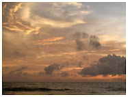
I don't know why or where this distillation started. It's not something I make a conscious point of doing but when I think back to somewhere I've spent time that is meaningful to me, I always have a sense of a tri-colour palette. A particular combination that captures the essence of the place, as I remember experiencing it.
Of course one might argue that this over-simplifies and does not allow for the changing moods and multiple layers of anywhere or any time. But it doesn't work like that for me. This colour summary is just that, a summary. A headline. Once accessed, it allows me to explore the whole picture, all the facets of the place in my memories of it. All the colours, not just the three, and all the thoughts and emotions and experiences behind all the colours become available again. It's like a mental filing system.
So, my childhood bedroom is stored in a memory folder of deep purple, forest green and fresh white (it was the late 60s, early 70s!)

My Nana's home, no matter where it actually was geographically, is always found under an emotionally charged headline of warm red, old gold and black

So, my childhood bedroom is stored in a memory folder of deep purple, forest green and fresh white (it was the late 60s, early 70s!)

1. Purple Pansy, 2. Purple and Green, 3. purple power
My Nana's home, no matter where it actually was geographically, is always found under an emotionally charged headline of warm red, old gold and black

And it happens with cities I know well and am connected to too...
Cape Town is - as befits a capital city in the Rainbow Nation - sea and sky blue, fynbos green and protea red

1. Canal Walk Business Park, 2. V+A Waterfront, Cape Town, 3. South African Flag,
4. Mouille Point Lighthouse, 5. Table Mountain - South Africa, 6. Kirstenbosch Protea flowers
4. Mouille Point Lighthouse, 5. Table Mountain - South Africa, 6. Kirstenbosch Protea flowers
Rome is terracotta gold, pine green and cerulean blue

1. Ground Floor PDR in Rome, 2. Rome, again and again and again...., 3. Fontana di Piazza Capitolina - Rome,
4. Orange mood, 5. Landscape of Ancient Rome, 6. Looking up? (in Rome)
4. Orange mood, 5. Landscape of Ancient Rome, 6. Looking up? (in Rome)
Paris is subtle silver, pewter grey and dusky blue


1. Cathédrale Notre Dame de Paris, Garden, 2. Paris - Musée du Louvre: La Victoire de Samothrace, 3. Liberty,
4. Life in Paris (III), 5. Pavement - Aug08, Paris (France), 6. Il vient parfois au Sacré Coeur des airs de Taj Mahal
4. Life in Paris (III), 5. Pavement - Aug08, Paris (France), 6. Il vient parfois au Sacré Coeur des airs de Taj Mahal
And London... London is undeniably red, white and black.

1. Black cab in London., 2. SwissRe Building (London), 3. London Tube - Way Out, 4. London - Sackville Street, 5. London - Piccadilly: Piccadilly Circus - Eros, 6. Double-deck red bus : a symbol of London., 7. Reflecting London, 8. London Red Telephone Box, 9. Aproximació al London Eye
I'm still waiting for the colour combo that captures my new city to crystallise. I know it will. In time.
I'm still waiting for the colour combo that captures my new city to crystallise. I know it will. In time.
Oh, and I do this colour triptych thing with people too...


.jpg)

.jpg)


6 comments:
What a wonderful way to 'capture' a place/person. I especially like your Paris colours-palette - it sounds exactly like the kind of place that I may love!
WOW! Beautiful! I LOVE your brain! I do that to some extent but not as beautifully as you! Have you ever looked into the psychology of colour?
Nice palettes ! especially Roma...
for having lived many years in Paris,well yes unfortunately Paris can be often grey but it's still romantic (hum...outside rush hours)
ps: i started tango classes but the thing is i'd rather dance with my boyfriend and he's too tall, so we gave up !
This is such a lovely post!!
I love your colour associations! I know it took my husband a long time to get over the fact that before I left home to marry him, my bedroom had chocolate brown, bright orange and yellow floral curtains, an orange rope monkey, orange string ball lampshade, etc! Rich coloour memories for me there!
anairam - based on what I've seen in the pictures of your home & your projects, I imagine that the Parisian palette and experience would suit you perfectly - subtle, sophisticated and just a touch quirky!
linda sue - thank you, you're lovely! I know they say blue is calming and red is stimulating etc. but I haven't really looked into the psychology of colour - perhaps I should? Sounds interesting.
m.c.i.s - I love Roma (with all it's chaotic madness and dilapidation) and Paris too! I only lived in Paris for a year and I agree that although it can be grey, I found the grey quite appealing in that context - not depressing, just soft and romantic.
It can be hard dancing with someone very tall, so I see why tango might not be the dance for you two :o)
krissy - thank you!
freshly found - that really made me smile... Sounds like 70's dream décor to me! We had one of those orange string ball lampshades in the dining room of the house with the purple bedroom - all very cool at the time and I love elements of that style even now. Now it's just Retro cool. Although, I draw the line at the green shagpile carpet that my cousins had in their house... Never good for me. :o)
Post a Comment